
Carl Jung, one of the 20th century's most esteemed behaviorists, famously declared, "Colors are the mother tongue of the subconscious." To this day, the profound implications of color resonate across every facet of our world, from product design and advertising to furniture and lighting. For interior designers creating spaces in higher education, senior living, corporate community areas, cafeterias, and government facilities, color selection is more than just aesthetics; it's a strategic tool.
There's little doubt that color impacts emotion and mood. The dominant hues within a space can fundamentally alter perceptions of the environment, influence behavior, and even affect the core essence of a business or institution. While cultural backgrounds, gender, and geography can subtly shift individual reactions, understanding universal color psychology allows designers to craft environments that optimize for specific functions and user experiences.
Pink: Playful Warmth & Gentle Accents
Psychology: Often associated with softness, love, sweetness, and optimism, pink is a trending color that offers versatility. Strategic Applications:
- Higher Education (Student Lounges, Dorm Common Areas): Accents of bolder pink in seating or decorative elements can introduce a playful, youthful energy, fostering an optimistic and welcoming atmosphere for students.
- Senior Living (Activity Rooms, Sunrooms): Softer, muted shades of pink can evoke feelings of embracement and warmth, creating gentle and comforting spaces without being overwhelming.
- Corporate Community Spaces: Used sparingly in breakout zones or informal meeting areas, pink accents can add a touch of modern optimism and encourage energetic interaction.
- Cafeterias: Subtle pink tones in upholstery or decor can create a comfortable, inviting ambiance without directly stimulating appetite like warmer reds.
Yellow: Optimism, Creativity & Focus
Psychology: Bright and bold, yellow embodies cheerfulness, optimism, and creativity, while also aiding in decision-making. However, moderation is crucial, as over-application can lead to feelings of overwhelm or stress. Strategic Application:
- Higher Education (Collaborative Study Zones, Innovation Hubs): Splashes of yellow in upholstery patterns, accent walls, or agile furniture can stimulate creativity and foster an optimistic mindset, ideal for brainstorming and group work.
- Corporate Community Spaces (Breakrooms, Innovation Labs): Yellow accents can inject energy and cheerfulness, helping to re-energize staff and promote a positive atmosphere. Its ability to aid decision-making makes it suitable for areas where quick informal discussions occur.
- Cafeterias: Small, cheerful touches of yellow can create a welcoming and energetic dining environment without causing agitation, enhancing the overall positive perception of the space.
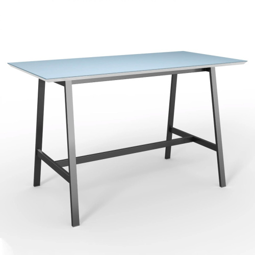
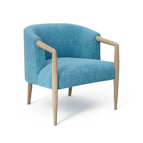
Blue: Trust, Dependability & Serenity
Psychology: With its diverse history and wide array of shades, blue promotes feelings of trust, dependability, relaxation, and tranquility – incredibly positive and powerful emotions. Strategic Application:
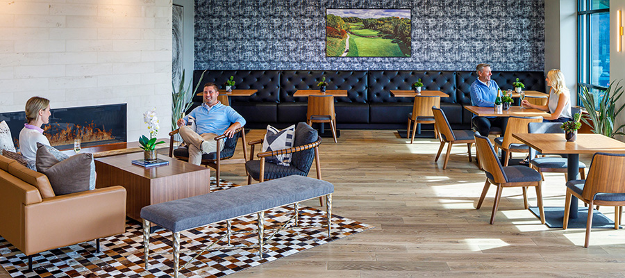
- Corporate & Government Spaces (Offices, Lobbies, Meeting Rooms): Incorporating various shades of blue can generate feelings of trust and professionalism, fostering a sense of reliability and calm. This is vital in environments where decision-making and sensitive discussions take place, such as banks or corporate buildings.
- Higher Education (Libraries, Administrative Offices, Student Wellness Centers): Deeper blues promote focus and stability, suitable for quiet study areas. Lighter blues can create calming environments in student wellness or counseling centers.
- Senior Living (Quiet Lounges, Resident Rooms): Soft blues promote relaxation and a sense of security, contributing to a peaceful and comforting atmosphere conducive to well-being.
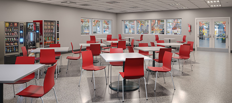
Red: Energy, Appetite & Impact
Psychology: A dominant primary color, red is associated with love, passion, confidence, appetite, and energy. Like yellow, moderation is key to avoid overstimulation and too much might give the impression of anger. Strategic Application:
- Cafeterias & Dining Spaces (Higher Ed, Senior Living, Corporate): Strategic use of red in seating, accents, or specific wall features can subtly increase appetite and energy, encouraging a welcoming and lively dining atmosphere.
- Corporate Community Spaces (Breakrooms, High-Energy Collaboration Zones): Small doses of red can inject vibrancy and stimulate conversation, but it is important not to go overboard.
- Government Spaces (Public Information Desks, Signage): As an accent, red can draw attention to important features or directives, conveying confidence and urgency where needed. Designers could consider red on interesting wall or ceiling accents, throw pillows, or even table bases for visual interest without overwhelming the space.
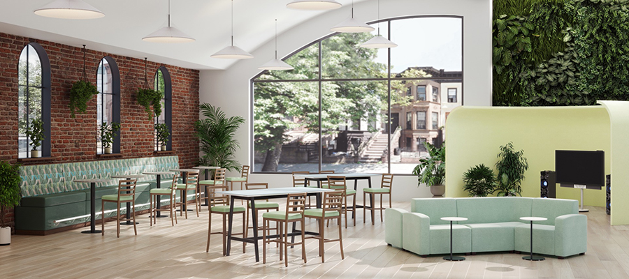
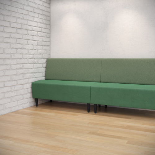
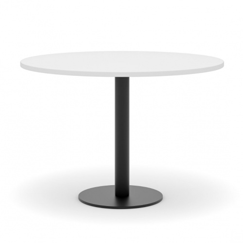
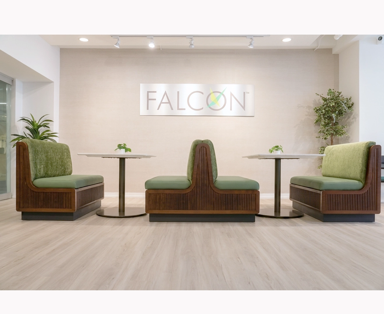
Green: Peace, Recovery & Biophilia
Psychology: Abundant in natural settings, green is universally associated with feelings of peace, recovery, security, nature, and well-being, all beneficial to emotional health. Green is one of the few colors that can be the primary hue of a space without being overwhelming. Strategic Application:
- Senior Living (Common Areas, Outdoor Views, Therapy Rooms): Due to its association with recovery and calm, green is highly effective. Designing green-oriented lounges or incorporating biophilic elements can relax residents and provide a sense of peace and safety. It can also be implemented into resident bedrooms to aid in relaxation before sleeping.
- Higher Education (Student Health Centers, Counseling Services, Study Nooks): Utilizing green can evoke positive emotions and a sense of good health, fostering a healing and calming environment. Green elements can provide a sense of nature and create a deeper sense of relaxation, ideal for students who may experience some academic pressure.
- Corporate Community Spaces (Breakout Areas, Relaxation Zones): Implementing green through planters, wall treatments, or upholstery supports mental well-being, reduces stress, and enhances focus, aligning with biophilic design principles. This can help create a welcoming and enjoyable space to be in, helping employees appreciate being in the office.
- Government Spaces (Waiting Areas, Consultation Rooms): Green can promote a sense of security and trust, creating a more reassuring environment for visitors.
Purple: Royalty, Creativity & Anxiety Relief
Psychology: A unique and rich color, purple represents royalty, mystery, creativity, and courage, and is known for its anxiety-relieving properties. This versatile color can be implemented heavily without overstimulating. Strategic Application:
- Corporate (Executive Lounges, High-Level Meeting Rooms, Creative Hubs): Purple velvet upholstery or soft patterned wallcoverings can elevate the feel of luxury and sophistication. Lighter lavenders can add a touch of creativity to innovation spaces.
- Higher Education (Art Studios, Performance Arts Spaces, Alumni Lounges): Encourages creativity and offers a sense of refined elegance, fitting for areas that inspire and host.
- Senior Living (Meditation Rooms, Exclusive Resident Lounges): Its anxiety-relieving qualities make it suitable for calming and contemplative spaces, while richer shades can add a touch of grandeur and richness.
Orange: Energy, Warmth & Connection
Psychology: Like yellow, orange is a vibrant and lively color that evokes energy, warmth, and is often associated with harvest, unity, and spirituality. There's a fine line between just enough and too much, with softer shades being more versatile. Strategic Application:
- Cafeterias & Community Dining (Higher Ed, Senior Living, Corporate): Softer, less vibrant shades of orange can be elegantly sprinkled through accents to generate a beautiful, warm, and welcoming space, encouraging social interaction and a feeling of community.
- Higher Education (Student Union Lounges, Game Rooms): Brighter orange in small doses can inject fun and energy, promoting lively student interaction.
- Corporate (Informal Collaboration Zones, Social Hubs): Can be used to create an inviting and energetic atmosphere that fosters a sense of unity and connection among employees.
The Strategic Power of Color in Design
Color is an incredibly powerful, multifaceted tool in the designer's arsenal. It can serve multiple purposes, from highlighting specific aspects of a design to setting an overall mood, and even subtly influencing occupant behavior. When used thoughtfully and intentionally, color can transform a space in remarkable ways, enhancing functionality and user experience.
By understanding how different colors evoke various emotions and perceptions, designers working in higher education, senior living, corporate, cafeteria, and government spaces can strategically leverage color to achieve their specific project goals. This knowledge allows for a more impactful application of color, making it an indispensable component in achieving successful, purposeful designs.
SHARE YOUR DESIGNS

Earn Extra Cash
Send us photos of your best Falcon projects completed within the last 12 months and we'll pay you $50 per project.
IN THE NEWS
Falcon’s Solution-Driven Designs at NeoCon 2026
NeoCon 2026 wrapped up at the Chicago Merchandise Mart, and the Falcon showroom proved you don't have to choose between high-end aesthetics, high-traffic durability, and environmental responsibility.
Read More